Friday 22 January 2010

Magazine Research. - Lizzie

About a week ago, i emailed a few magazines to ask and research exactly who their audience is, how they try to appeal to their niche audience, what style of music their aiming at and if they believe this limits their audience. I did not recieve any replys (so far) except from top of the pops magazine today.

This was to Rolling Stones Magazine.
and this was to Q Magazine.


Sunday 17 January 2010

Front Cover Deconstruction 3 - Lizzie


The top of the pops brand identity/ masthead is covered by Joe which shows Joe’s importance and that the brand identity is so recognisable it can even be partially covered up. Bottom left corner is the bar code, issue no., month and price. Joe is smiling and making direct eye contact with the reader making them feel happy as though there actually there with him and makes the audience feel good. Next to him on the left the Wanna Be Famous? Is a sell line with the use of pictures, bold fonts and highlighted words such as Famous (corresponding next to two pictures of famous people that many young teenagers would know). The bold words all over the cover create an attractive perspective for buyers. Fans, Fights and Fakers! Is a clever alliteration and is catchy for the reader. Its title is also in red which matches a colour theme with the clothes of N-dubz which are all wearing red. Underneath the guess who highlighted in a yellow arrow immediately stands out against Joes black and white clothes and the rhetorical question starts to get the reader thinking and makes them want to buy the magazine and read it to find out. At the bottom right the quote by Robert gives a sneak preview of what his interview is about. The use of the picture is also used for different reasons. It’s used to show who it is, he is famous and very recognisable to the magazines target audience and also it will attract a lot of girls as many find him attractive. JOE NEEDS YOU! Involves the audience and makes them feel wanted and helps make them feel a part of this magazine. Star style on a budget just above is something that will appeal to its audience and readers as part of the hierarchy of needs as everyone would love and dream to be able to dress and buy clothes like all the people in the papers with photographs by the paparazzi and this magazine is giving them an article that could help them escape from reality and step into the shoes of their idols. There are 7 pictures to make it eye catching for readers and to jump out on the shelf’s. It’s quite a hectic cover however all the minor stories surround Joe by the outer edge of the magazine so it shows he is the main story and the main focus of the cover. Its colours are mainly pink white and yellow which are very feminine colours. The blue behind Joe implies its connotation as relaxing and calm and is exactly how the magazine wants the readers to feel when they buy and read the magazine. I believe the demographic of the magazine would be young teenagers interested in pop music and celebrities. With the choice of artists and bands I would think that the main area of focus would be around 10years of age to 15. The use of colours suggests it’s mainly aimed at girls and is for people who get pocket money so depend on parents.

Analysis

Even though the magazine is still running and still on the shelf's and most newsagents and other shops, it is no where near as popular as it was when it was first released. I bought this magazine in WHSmith. However there is an actual section for music magazines featuring kerrang, Q, rolling stones and many more and including even more selected genres such as classical magazines. furthermore i found top of the pops amongst a bunch of other magazines in the kids section at the bottom of the shelf which means its not as well known and isn't even considered much of a music magazine anymore and more of a gossip column. the fact that its at the bottom of the shelf's hidden away suggests that it isn't bought by many people and has little status in the magazine industry. This is just one example of a failed magazine that hasn't ticked all the right boxes and appealed to its audience and demographic.

Case Study - Lizzie Front Cover Analysis


Kerrang- brand identity, masthead. Everybody recognises this and is what people immediately look for in the shop to find the magazine. Icon button- the star shape makes it look explosive and immediately catches the reader’s eyes. These usually contain competitions or free stuff. Skyline the running blue bar completely contrasts against the black heading making it stand out. It usually says something about a band for this one Avenged sevenfold and will catch reader’s eyes due to how famous and well known they are. As for the main picture, the man is directly shoot looking at the reader making eye contact with them and creates an instant connection making them feel involved and as if their seeing it from their point of view. At the bottom right hand corner there is the bar code, issue no, month, price and website address. Corresponding to the main picture, it has a little snippet of what the article is about. With EXCLUSIVE! It suddenly makes you pay attention and makes the reader feel like they’re in on the secret making them feel special. The word HIM is the name of the band is enlarged dramatically from the rest of the words and with an outline of pink like the highlighted colour behind EXCLUSIVE! Paramore and Hollywood Undead are highlighted in blue as subheadings of minor stories with little information underneath in white to make contrast. For all the minor stories the magazine uses the blue and white together to contrast the titles or to place background or border around things. It helps them to stand out and jump at you from the page away from the black clothes on the main photo. The pink curtains draped behind the man clashes dramatically with the blue so it separates the picture from the other stories making it easy to define what belongs to what. The pink is then further used in the little caption for that story by outlining words. The posters special in the bottom left gives the reader a chance to know what’s in the magazine and connects back with its other media by having posters of bands that would appear in the Kerrang tour and helps to promote and connect both forms of selling Kerrang to the audience. In the icon Join enter shikari’s crew! Sounds and would appeal to the fans right away and would immediately attract them to buy the magazine. Another minor story Masked Berkserkers On The Rampage! Makes the reader start to think what on earth has happened and draws them in leaving them on edge without any explanation making the audience buy the magazine to find out what it’s talking about. Towards the bottom under Blink 182 is says 10 years on: all the small things revisited. To fans this will be a funny little caption as one of blink 182 famous song is All the small things and would be like an insider’s joke so the readers and fans would feel special that they can share the joke and are loyal fans to know what it’s on about.

Case Study - Lizzie Layout


The layout uses simplicity to create an effect with just using 3 colours, purple, black and white. The colours complement each other well and Kerrang has expertise in this style and uses complimenting running colour themes throughout most of their stories in their magazine. It is neatly and formally presented with the HIM (music band) logo placed cleverly behind a title of Affairs of the Heart. (As the logo contains a hear shape within it.) It has two simple columns lined up to make it easy for the readers to know exactly where to start and the direction of reading. Columns are also a formal way of presenting things and would suggest that the article would be formal and compacted with information. It highlights certain words in purple and this layout automatically draws your eyes towards these words creating and instant reaction. A picture down either the left or right side is a typical layout form and is one that is used in this article. Everything is neatly specially presented as to not overpower the simple meaning of the article and so it’s easy to read instead of overcrowding the page with information making in difficult to read and know where to start. All the words are neatly in line in a fixed position making it simpler for the eyes of the reader.

Case Study - Lizzie Language


Case Study- Lizzie


Friday 15 January 2010

Genre Research - Lizzie

Indie rock is a genre of rock music that originated in the United Kingdom and the United States in the 1980s and earlier. The term is often used to describe the means of production and distribution of independent underground music, as well as the style of music that was first associated with this means of production. Indie rock artists are known for placing a premium on maintaining complete control of their music and careers, releasing albums on independent record labels (sometimes self-owned and operated) and relying on touring, word-of-mouth, airplay on independent or college radio stations and, in recent years, the Internet for promotion. Musicians classified as indie rock are typically signed to independent record labels, rather than major record labels, although there are many examples of indie musicians switching to major labels mid-career. This practice blurs the lines between indie and mainstream music and is often the subject of debate amongst fans. Indeed, some bands that have spent most of their careers on major labels are still occasionally referred to by the press as indie rock because of their sound or aesthetic.

Major Instruments used: Guitar, Bass, Drums, Keyboard, Synthesizer

Cultural Origins: Early 1980's from the United Kingdom, United States and Canada

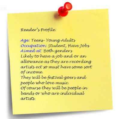
Reader Profile

Questionnaire - Lizzie